The information on this page refers to License Statistics v6.15 and newer, which changed and added columns in the User Usage History grid. If you are using a version previous to v6.15, see documentation for previous versions. |
To see a report on usage history for a specific user/user group, select the Usage page under the Users: History section in the left navigation pane. You can add the Usage History grid and graph to the License Statistics Dashboard. Learn more about customizing the Dashboard.
The General Information area lets you select the user/user group for which to view denials and displays details for that user, including matching cloud users, if applicable.
Filtering results
The Settings panel above the grid lets you filter results.
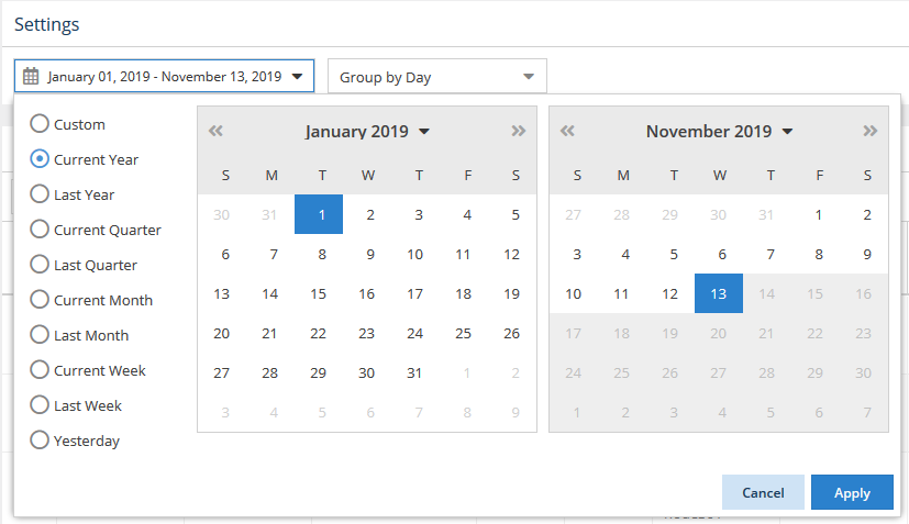
Time interval setting
The time interval options let you specify the time interval to include in the results. The time interval can be:
- Current or Last Year
- Current or Last Quarter
- Current or Last Month
- Current or Last Week
- Yesterday
- Custom (which lets you select a specific start and end date from the calendars)
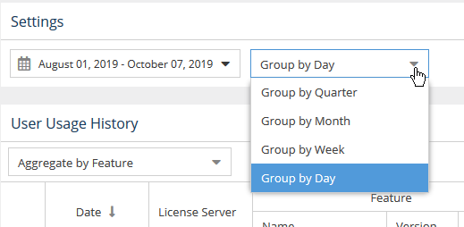
Group by setting
You can control how much detail is shown for usage history by setting the Group by option to:
- Quarter
- Month
- Week
- Day
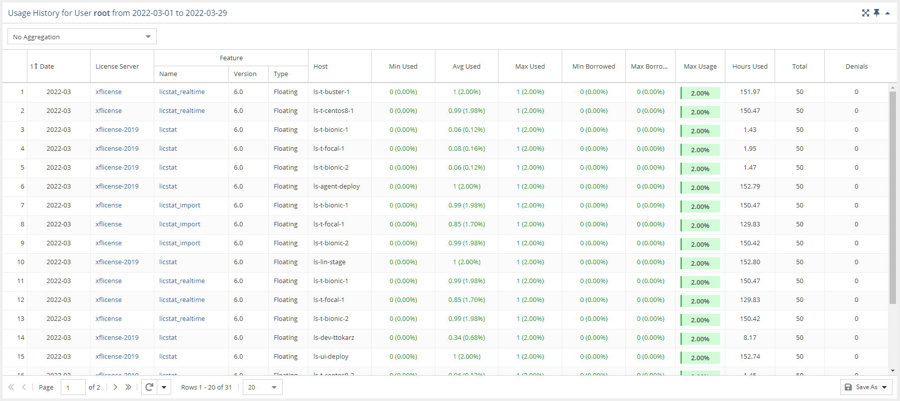
User Usage History grid
The User Usage History grid includes information about the selected user/user group's license usage, including the date of usage; the license server; feature information; the host that licenses were checked out from; the minimum, average, maximum and total number of licenses used; the maximum number of licenses borrowed; the maximum percentage of usage; the number of hours licenses were used; and the number of denials.
When viewing usage history for a user group, you may choose to aggregate results by Feature or by Feature and User. The default is no aggregation.
User Usage History graph
The User Usage History graph gives you a visual picture of the number of licenses that were used by the selected user/user group for the specified time period.
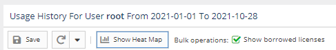
You can hide or show borrowed licenses using the "Bulk operations" checkbox above the graph. The display of usage details in the graphs can be controlled by clicking on features in the legend above the graph that you want to hide in the chart.
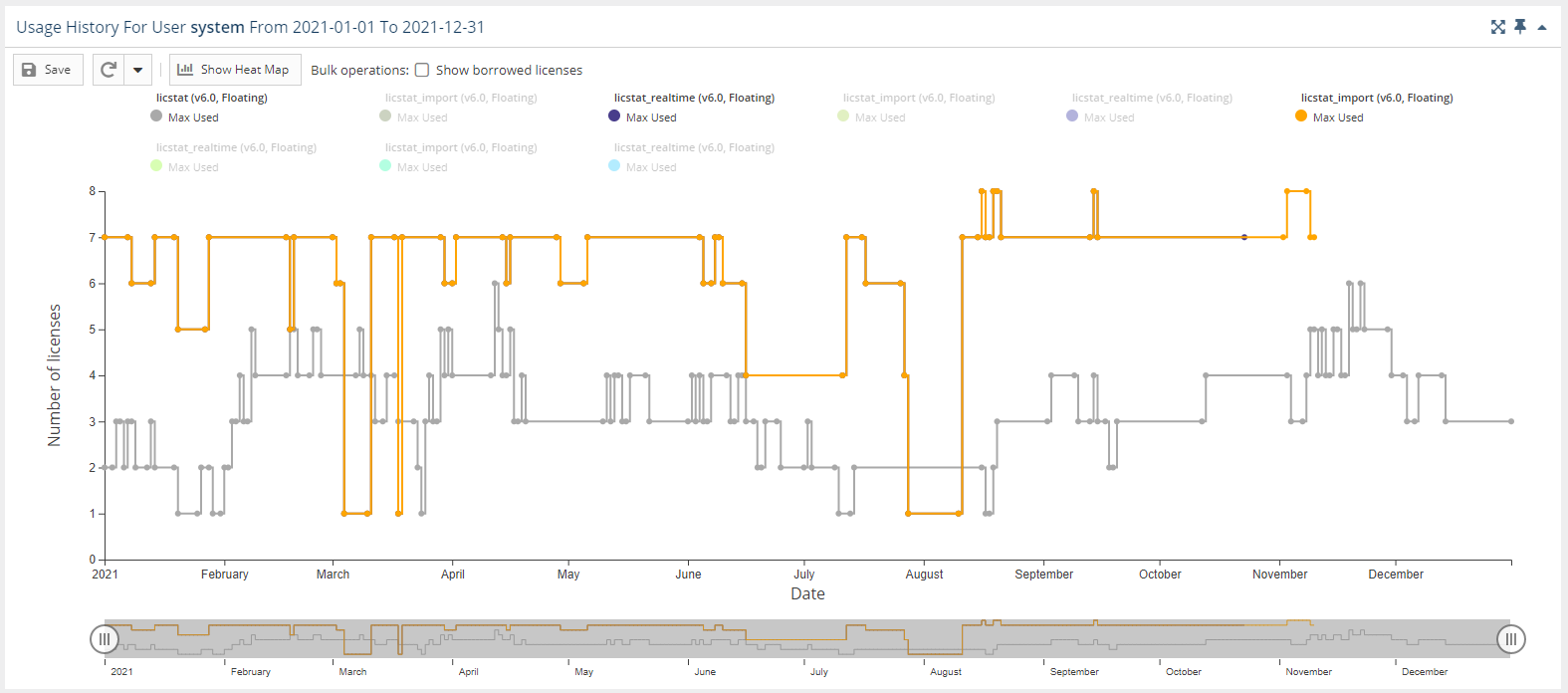
You can switch between viewing the data in the above format and viewing it as a "heat map" by clicking the "Show Heat Map" button at the top of the chart.
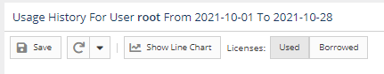
To switch the format of the chart back to a line chart, click the "Show Line Chart" button at the top of the chart.
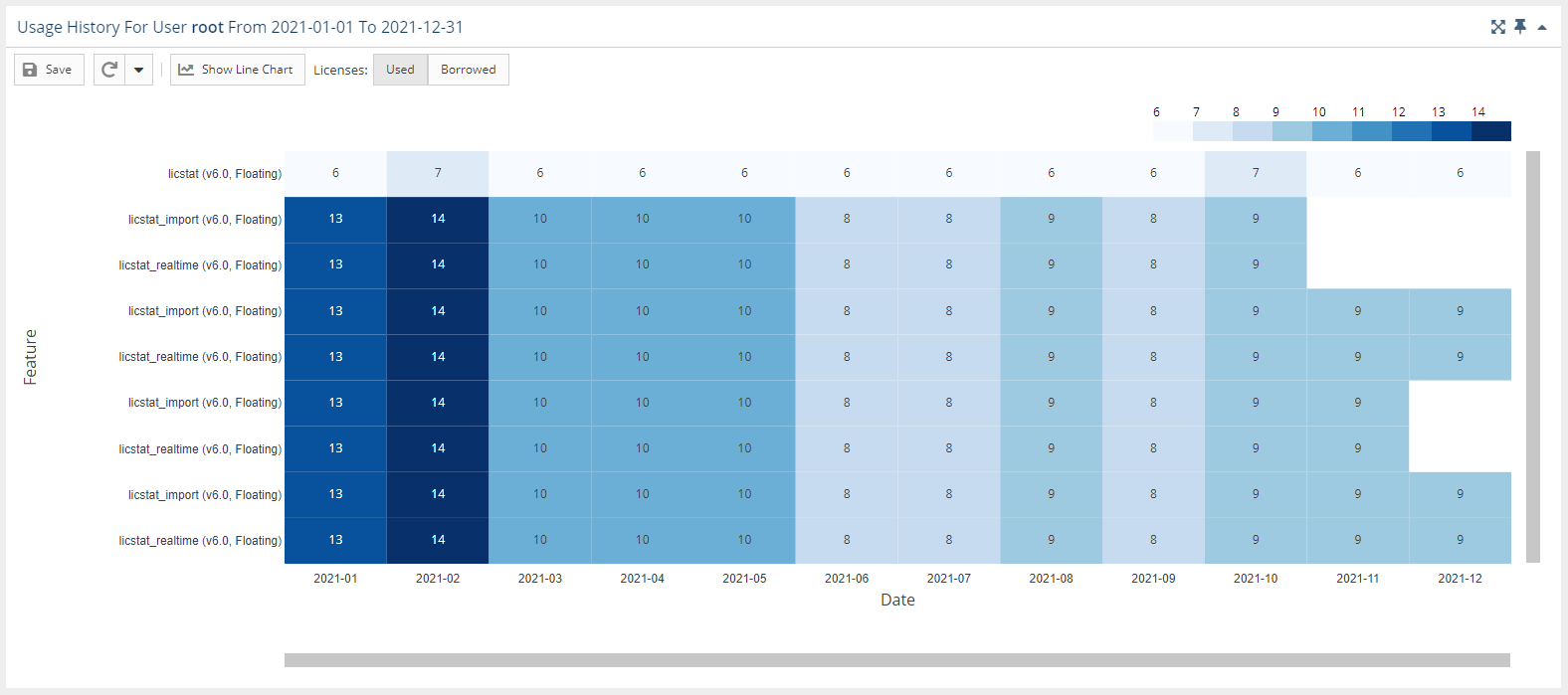
In the heat map version of the chart:
- You can toggle between used or borrowed licenses.
- The X axis reflects the grouping you selected in the Settings area at the top of the page.
- The Y axis contains list of all features that were used by the user or user group in the selected time range.
- The overlapping of the axes is the number of licenses used, with background coloring that corresponds with the scale.
- You can window an area in the chart to zoom into that area. After zooming into an area on the chart, you can return to the default zoom level using the Reset Zoom button at the top of the chart.
There are technical limits beyond which the chart cannot be rendered. It will not be visible if any of the conditions are met:
- more than 60 features are selected
- there are more than 80k points for less than 20 features
- there are more than 40k points for more than 20 features