...
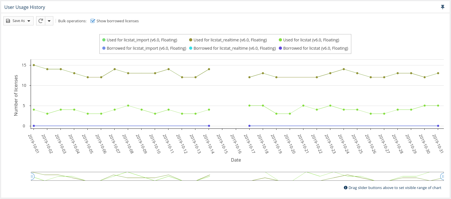
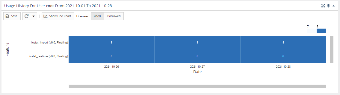
You can hide or show borrowed licenses using the "Bulk operations" checkbox above the graph. The display of usage details in the graphs can be controlled by clicking on features in the legend above the graph that you want to hide in the chart.
NEED NEW SCREENSHOT TO REPLACE THE ABOVE ILLUSTRATION TO SHOW MORE DATA AS IN THE OLD ILLUSTRATION, BELOW.
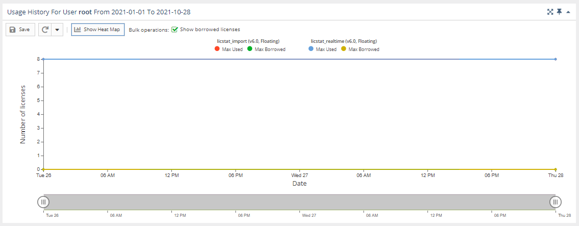
You can switch between viewing the data in the above format and viewing it as a "heat map" by clicking the "Show Heat Map" button at the top of the chart.
...
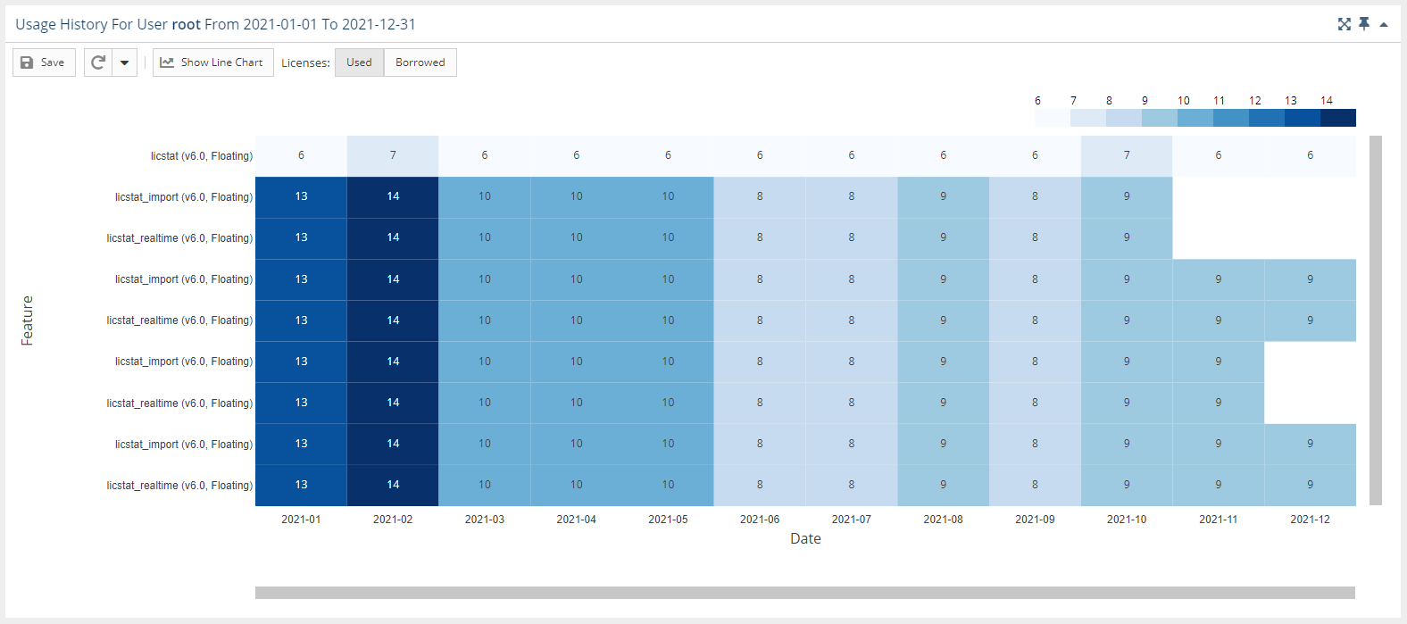
The heat map format looks like the following example:
NEED NEW SCREENSHOT TO REPLACE THE ABOVE ILLUSTRATION TO SHOW MORE DATA AS IN THE OLD ILLUSTRATION, BELOW.
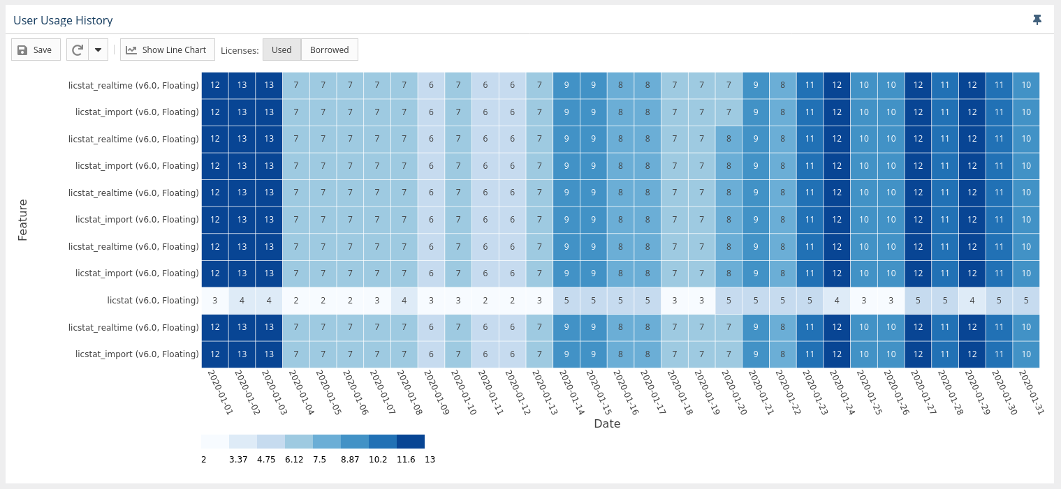
In the heat map version of the chart:
- You can toggle between used or borrowed licenses.
- The X axis reflects the grouping you selected in the Settings area at the top of the page.
- The Y axis contains list of all features that were used by the user or user group in the selected time range.
- The overlapping of the axes is the number of licenses used, with background coloring that corresponds with the scale.
- You can window an area in the chart to zoom into that area. After zooming into an area on the chart, you can return to the default zoom level using the Reset Zoom button at the top of the chart.