...
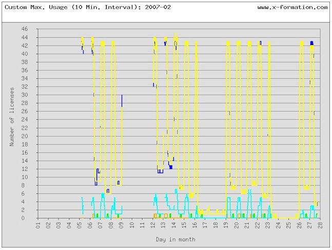
The following example shows a Custom Max Usage graph produced by merging two databases and then using the custom reporting utility to generate the HTML page. A legend preceding the graphs defines the colors used for each entity (user, group, feature) in the report.