...
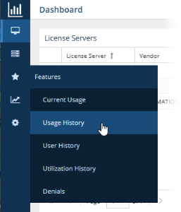
When the navigation pane is collapsed, icons remain so you can still navigate to desired pages:
Limiting pick list content
...
The Dashboard, License Server, and Features pages include collapsible areas that let you control how much information is displayed on the page at one time. These areas have a collapse/expand arrow on the right side of the title bar. You can collapse/expand these areas by clicking on the collapse/expand arrow or simply by clicking anywhere on the title bar. (You can also expand/collapse the navigation pane as described above.)
Filtering results in reports
You filter report results using the options in the Settings panel. Options differ per report, but the general usage of these settings is similar, as described below.
Aggregation
Some reports let you aggregate results. Types of aggregation include:
- Username
- Hostname
- Username and Hostname
- User Group
- Host Group
- Feature
- Server
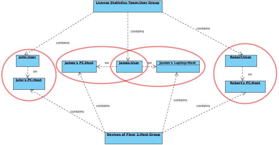
How aggregation is applied in a report
Aggregation enables you to specify detailed levels of the produced results. License usage information can be displayed for a specified entity, letting you juxtapose one set of data with another.
| Expand | ||
|---|---|---|
| ||
The following diagram shows how License Statistics aggregation options are used by real-world entities in a company.
|
Date range
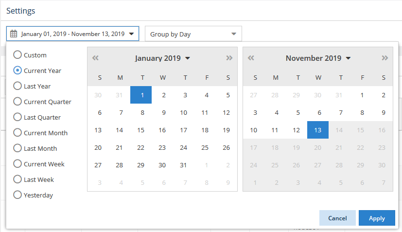
Selections for the date range you want to include in a report differ depending on the report. Date range selections may include:
- Current or Last Year
- Current or Last Quarter
- Current or Last Month
- Current or Last Week
- Today
- Yesterday
- Custom (which lets you select a specific start and end date from the calendars)
For example, the following illustration shows that the current year has been selected for report results:
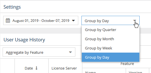
Grouping by time units
Some reports let you group usage information by:
- Day
- Week
- Month
- Quarter
For example, the following illustration shows selecting to group usage information by the day, giving the most detailed results:
How grouping by a unit of time works in a report
Grouping by a unit of time lets you group values from specified fields together. For example, license usage information can be limited to a month, and within that month displayed based on daily usage. Grouping works in the same way for all other available time units, for any set of selected values.
| Expand | ||||||||||||||||||
|---|---|---|---|---|---|---|---|---|---|---|---|---|---|---|---|---|---|---|
| ||||||||||||||||||
Let's assume the following values have been returned after grouping feature usage information by Day.
When we choose to group the above feature usage information by Month and set the start date to April 4, 2014, we obtain the following values:
When we decide to set the start date to April 1, 2014, we get the following values:
|
Showing/hiding
...
data in graphs
There are several controls for limiting data shown in reported statistics graphs to only the information you're currently interested in, as described below.
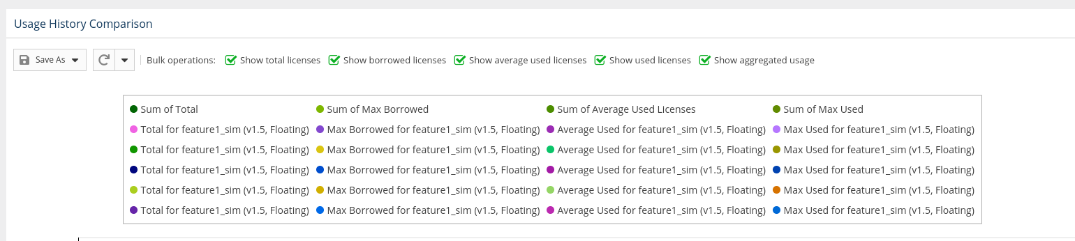
Using bulk selection toggles
Some graphs, such as in the chart in the Usage History Comparison report, include toggles at the top of the graph that let you specify what to include in the report. For example, you can toggle off visibility of borrowed licenses, total licenses, etc., as applicable to the report.
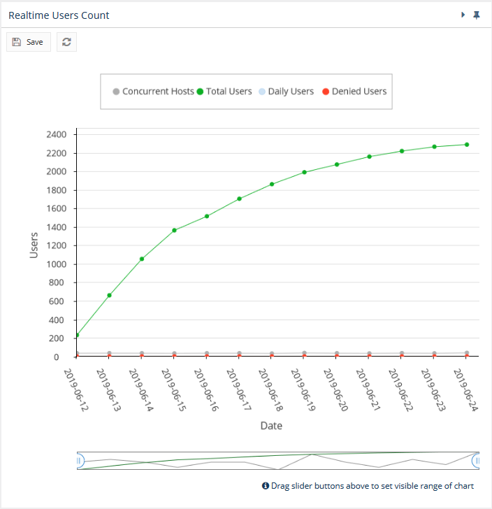
Controlling graph lines using legend labels
You can click on the labels in the legend at the top of License Statistics graphs to show/hide the data for that label. For example, the illustration below shows graph lines for all the data that is labeled at the top of the chart:
...
The following example shows the result of clicking on the "Daily Users" label, which hides its graph line in the chart and grays out the label color. To re-display a hidden graph line, simply click its label again.
Timeline sliders
For some charts, you can show particular portions of the timeline included in the chart by dragging the sliders located below the chart. There are two sliders; one on each end of the slider area. You can move the individual sliders by holding the mouse button directly on the slider, as shown below.
...