...
The General Information area includes identifying information for the feature, including the last update time. You can edit the feature details by clicking the Edit icon on the right end of the General Information title bar.
Advanced Filtering
...
The Advanced Filtering area lets you filter the information that displays in the Feature Usage History grid to see information for specific intervals. The filters will also be used when downloading the data to a file. Using the and graph by specified intervals. Using the pick lists in the Advanced Filtering area, you can choose to show results in the Feature Usage History grid by the following intervals and selecting the desired dates from the Date range calendar:
- Yearly (may be grouped by quarter, month, week, day, or hour)
- Quarterly (may be grouped by month, week, day, or hour)
- Monthly (may be grouped by week, day, or hour)
- Weekly (may be grouped by day or hour)
- Daily
- Custom (lets you select the start date and end date for which to view statistic and may be grouped by quarter, month, week, day, or hour)
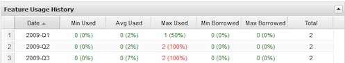
For example, if you choose to group results by quarters in a selected year, your results will look similar to the following:
The Advanced Filtering area also lets you choose whether to show used, borrowed and total licenses on the graph. For more information about graphs, see Feature usage graphs.
Average usage calculation
The average usage (Avg Used column value) is computed differently depending on how the usage history data is grouped.
- When data is grouped by Day, the average usage is the weighted average of licenses used in particular day. For example, if you use 1 license for 8 minutes, then use 6 licenses for 2 minutes, the average usage is calculated as (1*8 + 6*2) / (2+8) = 2.
- When data is grouped by Week, the value displayed is the mathematical average of the weighted averages.
Feature Usage History grid
...
- Red: 90% - 100% utilization
- Yellow: 70% to 89% utilization
- Green: 0% to 69% utilization
If you filter the grid data using the grid columns, those filters will also be used in the graph and when downloading the data to a file.
Feature Usage History graph
The Feature Usage History graph plots the number of licenses used per day, shown in hourly intervals, throughout the selected month. This graph gives you a quick picture of license usage fluctuation during the selected month. See Feature usage graphs for additional information about feature use graphs.
Average usage calculation
The average usage (Avg Used column value) is computed differently depending on how the usage history data is grouped.
...
Note that the graph reflects the filters you apply and the number of rows you select to display in the grid. For example, if you
...
choose to show only 20 rows of data in the grid, only those 20 rows of data will be depicted in the graph.
See Feature usage graphs for additional information about feature use graphs
...
.