...
The information on this page refers to License Statistics v6v7.24 2 and newer, which added the ability to edit a user's email address and changed "LDAP" labels to the generic label "User Directory."modified the UI for working with License Statistics pages. If you are using a version previous to v6v7.242, see documentation for previous versions. |
| Info |
|---|
| Customizing License Statistics pages with different colors, graphics, etc. is currently not supported. |
License Statistics UI pages are intuitive to work with and include many features that help you quickly find and view the information most important to you. Basic information about working with the License Statistics UI is described in the following sections.
Navigation
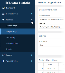
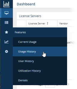
Navigation Navigating to License Statistics pages is done using the left pane of the application window. Click on the arrows to expand/collapse sections and click on items under the sections to switch to that page. The following illustration shows switching to , as shown below for accessing the "Features: History Usage History" page.

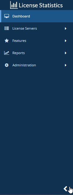
You can expand and collapse the navigation pane using the expand/collapse arrow at the bottom of the pane.
When the navigation pane is collapsed, icons remain so you can still navigate to desired pages:

Expanding content to maximum size
Most content can be expanded to take up the entire License Statistics application window by clicking the "Maximize" icon  at the upper right corner of the page/area.
Maximizing the content is particularly useful for viewing reports that have a large amount of data, more easily viewing data on a phone or tablet, or setting the view up for a screen capture.
...
For most reports (other than Administration reports, which do not support a public API), you can see a preview of the API resources for that report by clicking the "Show API resource" Options icon at the upper right corner of the reportthe page, and then selecting API Resource from the Options menu.

An After clicking this icon, an API Resource window opens, with details of the API request used to generate the report, including the headers, endpoint and used parameters. You can use this information to facilitate integration with other tools, such as PowerBI, Excel, or any other application that you want to allow to access the License Statistics data.
...
Collapsing/expanding areas
The Dashboard, License Server, and Features Some pages include collapsible areas that let you control how much information is displayed on the page at one time. These areas have a collapse/expand arrow  on the right side of the title bar. You can collapse/expand these areas by clicking on the collapse/expand arrow or simply by clicking anywhere on the title bar. (You can also expand/collapse the navigation pane as described above.)
| Anchor | ||||
|---|---|---|---|---|
|
...
- Red: 90% and above
- Orange: Below 90% and above 70%
- Green: Below 70%
For example, the percentages shown under the Used column 's percentages includes include color - coding:

Color - coding is also used for license server "last update time" and feature reservations "last active" information to indicate the number of query intervals elapsed since the last successful query:
| Query intervals elapsed | Color indicator |
|---|---|
| 0 - 1 | Green |
| 1 - 2 | Orange |
| 2 or more | Red |
Anchor filter filter
Filtering results in reports
| filter | |
| filter |
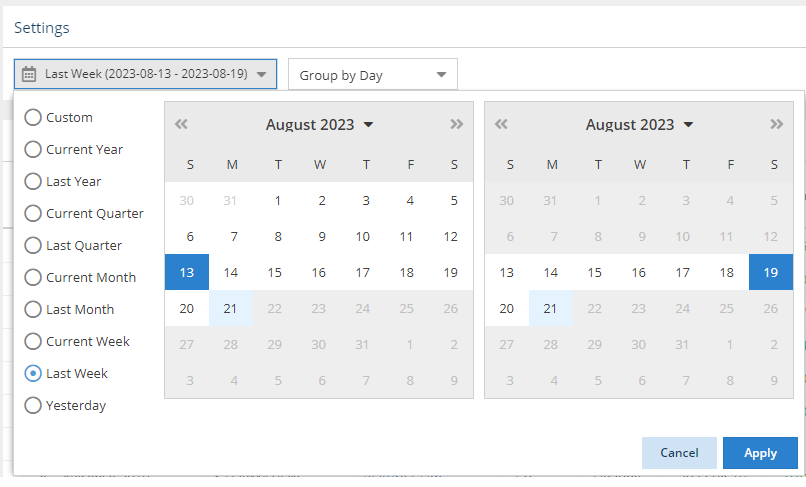
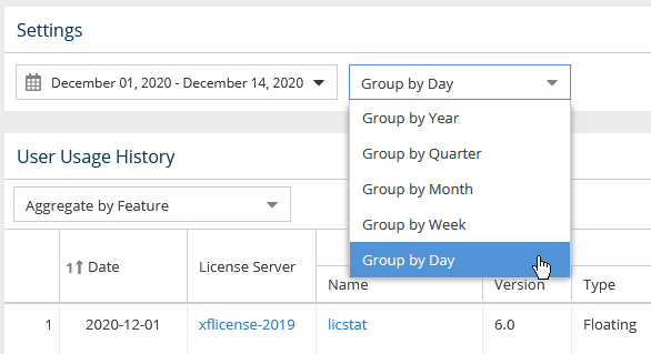
You can filter report results using the options in the Settings panel. Options differ per report, but the general usage of these settings is similar, as described below.
...
For example, the following illustration shows "Last Week" selected for report results. The range moving forward will always reflect "last week" according to the current date, rather than the particular dates effective at the time the option was chosen.

Grouping by time units
...
For example, the following illustration shows grouping usage information by the day, which gives the most detailed results:

How grouping by a unit of time works in a report
...
| Expand | ||||||||||||||||||
|---|---|---|---|---|---|---|---|---|---|---|---|---|---|---|---|---|---|---|
| ||||||||||||||||||
Let's assume the following values have been returned after grouping feature usage information by Day.
When we choose to group Grouping the above feature usage information by Month and set setting the start date to April 4, 2014, we obtain 2026 results in the following values:
When we decide to set Changing the start date to April 1, 2014, we get 2026 results in the following values:
|
Showing/hiding data in graphs
There are several controls for limiting data shown in reported statistics graphs to only the information you're currently interested in, as described below.
...
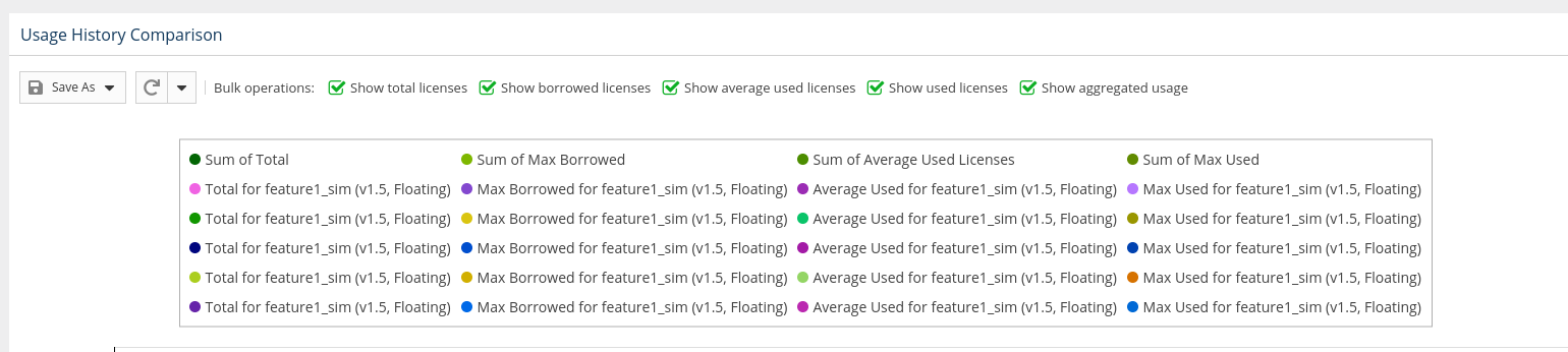
Toggling visibility of graph data
Some graphscharts, such as in the Usage History Comparison chart in the Usage Features: History Comparison report, include toggles at the top of the graph that let you specify what the data to include in the report. For example, you can toggle off visibility of borrowed licenses, total licenses, etc., as applicable to the report.graph. To toggle visibility of data in a graph, click the Options iconat the top of the page, select Series from the Options menu, and toggle on/off the available options as desired. The following illustration shows Borrowed, Average Used, and Aggregated results data toggled off.

Controlling graph lines using legend labels
You can click on the labels in the legend at the top of License Statistics graphs charts to show/hide the data for that label. For example, the illustration below shows graph lines for all the data that is labeled at the top of the chart:
...
| Note |
|---|
There are technical limits beyond which the chart cannot be rendered. It will not be visible if any of the conditions there are met:
|
...
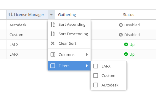
Sorting and filtering controls are accessible by hovering over the column heading and then clicking on the arrow Options icon
that appears at the right side of the column heading, as shown for the Name column in the illustration below. 

A drop-down menu gives you the following options for viewing the grid contents, including:- Filtering the grid contents by entering text to filter by. As you type, the grid will update to display only the content that includes the text you have entered. (Some columns let you filter by selecting available options instead of entering text, as described below.)
- Sort by ascending/descending order Sort by selected columns in ascending/descending order (see "Sorting" below for more information).
- Hide/show columns (select the Columns option, then toggle the list of columns on/off). Some columns are hidden by default, as described below.
- Limit the grid contents (select Filters and then select the available options, or enter text for text fields).
- For license managers, you can filter by type:
- some columns are hidden by default, as described below).
- Use the settings at the bottom of the grid to select pages to view and control the number of rows to display per page (20 - 1000).Some columns, such as Feature Type, let you filter by options instead of entering text:

- The filters you apply and the number of rows you select to display in the grid will also be used when downloading the data to a file. For some pages, these settings are also used in the graph content.
Anchor Sorting Sorting
Sorting by columns
| Sorting | |
| Sorting |
When sorting grid content by columns:
- Grids may be sorted by any column by simply clicking on the column header. Clicking the column header again will toggle between ascending/descending sort order. You can also use the Sort Ascending and Sort Descending options in the column header drop-down Options menu.
- You can sort by up to three columns. The sort order is indicated by a number to the left of the column heading label.


- You can remove the sort from a column by clicking "Clear Sort" in the column header drop-down menu.
Anchor visibility visibility
Column visibility
| visibility | |
| visibility |
Feature and user reports share some common content, such as license server name, feature name, and so on. To make reports less cluttered and easier to read, some grid columns are hidden by default across all reports that contain those columns. Controlling column visibility and default visibility settings are described below.
...
You can toggle visibility of columns by selecting the Columns option under the column header's drop-down menu, as illustrated below for the User column. clicking on the Options icon at the top of the page, and then selecting Columns from the Options menu. To restore the column visibility settings to their defaults, select Restore defaults at the bottom of the Columns pane.


Anchor HiddenColumns HiddenColumns
Common grid columns and default visibility settings
| HiddenColumns | |
| HiddenColumns |
...
Refreshing data in grids and charts
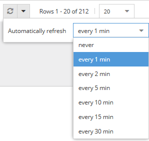
You can refresh data at any time data at any time by clicking on the Refresh icon  at the top right of the page.
To change the refresh interval, click on the Options icon located to the right of the Refresh icon, and then select Edit from the Options menu. A Settings dialog will open to allow you to change the automatic refresh interval, which is 1 minute by default.

Anchor rows rows
Setting number of rows to display per page
| rows | |
| rows |
You can control the number of rows to display per page (20 - 1000) by clicking on the Refresh Options icon located at the bottom top of grids and charts.
Clicking on the arrow next to the Refresh icon lets you set the automatic refresh interval, which is 1 minute the page, and then selecting Edit from the Options menu. A Settings dialog will open to allow you to change the page size setting, which is 20 rows by default.

Persistent page settings per user
...