...
The Dashboard, License Server, and Features pages include collapsible areas that let you control how much information is displayed on the page at one time. These areas have a collapse/expand arrow on the right side of the title bar. You can collapse/expand these areas by clicking on the collapse/expand arrow or simply by clicking anywhere on the title bar. (You can also expand/collapse the navigation pane as described above.)
| Anchor | ||||
|---|---|---|---|---|
|
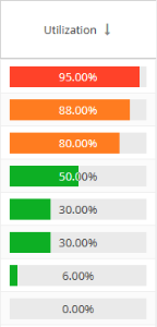
Colors used in graphs and charts help you to see immediately the percentage of licenses being used:
- Red: 90% and above
- Orange: Below 90% and above 70%
- Green: Below 70%
For example, the Utilization column's percentages includes color-coding:
Color-coding is also used to indicate the minutes elapsed for license server "last update time" and feature reservations "last active" information:
| Minutes elapsed since last update time | Color indicator |
|---|---|
| 0 - 10 | Green |
| 10 - 20 | Orange |
| 20 or more | Red |
Anchor general_info general_info
General Information area in reports
| general_info | |
| general_info |
The General Information area in reports includes identifying information for the feature and a summary of usage information, including a current count of licenses used, borrowed and reserved, the total licenses available, the feature's expiration date, the feature's utilization percentagelast update time, and a share code if sharing is in use (for example, "Shared on HOST" or "Shared on VIRTUAL).
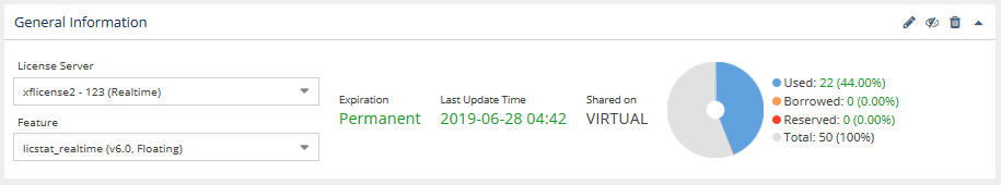
A color-coded gauge shows the current license count and utilization percentage for licenses used, borrowed, and reserved, as well as the total number of licenses available if known; otherwise, the "Total" count is not displayed in the chart,
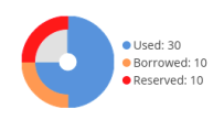
If there are unlimited licenses for the feature, the license usage gauge will not show the total number of licenses or utilization percentages, since they are not applicable, as illustrated below.
Filtering results in reports
...
The area between the sliders is like a "window" on the timeline. In the example above, the sliders have been moved to show only the middle part of the chart's timeline.
Usage color coding
Colors used in graphs and charts help you to see immediately the percentage of licenses being used:
- Red: 90% and above
- Orange: Below 90% and above 70%
- Green: Below 70%
For example, the Utilization column's percentages includes color-coding:
Color-coding is also used to indicate the minutes elapsed for license server "last update time" and feature reservations "last active" information:
...
Green
...
Anchor filtering filtering
Sorting and filtering grid content
| filtering | |
| filtering |
...