...
The area between the sliders is like a "window" on the timeline. In the example above, the sliders have been moved to show only the middle part of the chart's timeline.
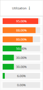
Usage color coding
Colors used in graphs and charts help you to see immediately the percentage of licenses being used:
- Red: 90% and above
- Orange: Below 90% and above 70%
- Green: Below 70%
For example, the Utilization column's percentages includes color-coding:
Sorting and filtering grid content
...