The information on this page refers to License Statistics v6.14 and newer, which reorganized reports. If you are using a version previous to v6.14, see Removed Features. Also note that for a limited time, the old menu structure in the License Statistics UI will be retained, so if you cannot locate what you're looking for with the new menu structure, you can try locating it using the old structure. |
To see a report that compares usage history, select the Usage History Comparison page under the Reports section in the left navigation pane.
To create a report:
- Select New Usage Comparison from the Usage History Comparison drop-down list at the top of the page.
- Under the Manage Features in Comparison area, select the features you want to include in the report from the All Features grid, and then click Add to add them to the Feature On Comparison grid.
You can also drag and drop your selections between the lists to add or remove them from the report. - Adding a feature to the Feature On Comparison list will automatically open a dialog that lets you enter a name and optional description for the report. After completing this information, click Save to create the report.
- In the Settings area, select the Grouped by and Time Interval filtering to apply to the report, as described for the Feature usage history page.
- Click Apply to create the report.
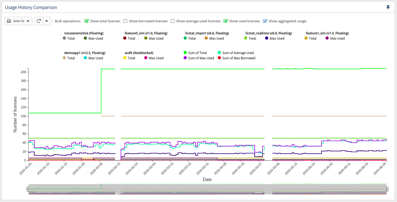
- Adjust the chart display as needed to see only the details you are interested in.
- You can show or hide certain details in the report graph (such as borrowed licenses and average used licenses, as shown in the illustration above) using the "Bulk operations" toggles at the top of the graph.
- You can also show or hide details per feature by clicking on the color identifiers in the legend at the top of the graph. Hidden feature detail items appear grayed out in the legend, as shown for the "Max Borrowed" legend item below.
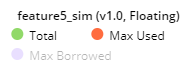
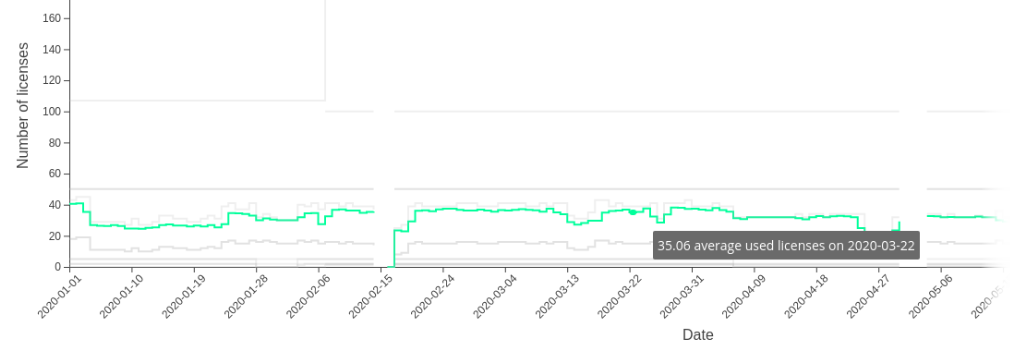
- You can hover over a graph line in the chart to highlight that line and gray out the others. The example below shows the green line in the graph being hovered over. Details about the highlighted line also appear, as illustrated below with the detail "35.06 average used licenses on 2020-03-22."
- If you change the Grouped by or Time Interval filtering (as set in step 4 above), the X axis of the chart will update dynamically.
There are technical limits beyond which the chart cannot be rendered. It will not be visible if any of the conditions are met:
- more than 60 features are selected
- there are more than 80k points for less than 20 features
- there are more than 40k points for more than 20 features
To view and modify an existing report:
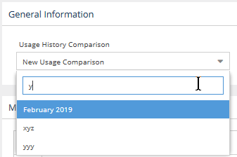
To view a previously saved Usage History Comparison report, select it from the Select Usage History Comparison drop-down list at the top of the page. If you have a large number of comparisons, you can find the report you are interested in quickly by entering all or part of the report name in the Usage History Comparison drop-down. For example, if you type "y" as a filter, only the saved reports that include the letter "y" will appear in the list, as illustrated below.
After you have created the report, you can change Settings and add/remove features as described above for creating a report, then click Apply to update the report.
Exporting to external formats:
The Usage History Comparison grid can be exported to external formats (CSV, XLSX or PDF) in the same way as other grids, as described in Downloading License Statistics data. In addition, you can export the data for the chart to these same formats or to PNG format using the Save button in the upper left corner of the chart. Note that only the PNG option exports the chart image; the other formats export only the data used to generate the report.